I'm principally talking about look and feel. iOS looks and operates great, let's get that out of the way. But it's essentially the same core design that was laid out in 2007 + Androidish notifications + multitasking-lite. At a glance can the average user tell the difference between iOS 2 or 3 and 6?
I acknowledge that that's not necessarily an entirely worthy goal in and of itself, but keeping a design focused product fresh does have its merits.
Other than the obvious lack of a wallpaper I'm not really sure that there's been any fundamental work on improving the user interaction and look & feel of the thing in 5 years.
I find it unbelievable that there's nothing that could be done better and that iOS was launched with perfect interaction design, fully formed from the heads of the designers, or perfect visual design, reverently propagated to the modern day and on into the future.
Is this really the penultimate in volume slider design? There's no more work to be done here?
I think this recent shakeup is Apple signaling that it's time to evolve again and that excites me much more than the last 2 or 3 product launches have.
If anybody can put out a new way of pushing electrons around and making it "just work" it's going to be Apple and I want to see what they come up with.
All of what you've listed is just repeating the same point: iOS hasn't changed much since its inception. But you're still not answering the question: what needs to change?
Don't get me wrong, it's not that I think it can't be improved, because I can think of a few needed improvements myself. But I hear people continue to say this about Apple -- "They aren't innovating lately." -- without saying what needs to change.
So, without just comparing iOS1 vs. iOS6, what about the current state of iOS needs to change?
I'd like to see Intents or Contracts or something so that apps can reasonably an reliably communicate. The walled gardens that iOS has is fairly obnoxious.
I have both an iPhone and Nexus 7, and I keep forgetting on N7 that sharing to Evernote doesn't require laborious app switching and cut and pasting. It's a very real, important piece of the puzzle that Apple hasn't even bothered trying to attempt.
I want widgets on the desktop and/or on the lock screen (as a developer api), sideloading applications, some way to store data accessable to any app, a phone number black or whitelist, and a way for users to allow an app to do arbitrary tasks in the background or refuse any app from doing the Apple-allowed tasks in the background. Oh, and keyboards, developers should be allowed to make keyboards.
Then there are a ton of stupid UI issues they have, like when I open a new tab in mobile Safari, I don't want it to gain focus.
I'd like to be able to update the software on it without needing to rearrange apps into the order I want them yet again, I don't have any idea if that is possible or not.
You could make the same arguments that adding browser
bookmarks or more apps would clutter your home screen. I'm not suggesting that all contacts be added to the home screen, just a few that I call every day.
I don't know what the proper name of the button is, but my colleague's android doesn't have consistent behavior across all apps. I really meant it to mean that there are also a lot of things I'd want to change in Android also, but the topic was iPhones.
Look and feel-wise...the iOS look is getting dated. I don't think they should parrot the flat square look Microsoft is going for nor the Tron look in Android. But this
I'm not a visual designer so I'm not sure I'm entirely qualified to offer suggestions, but there are other button styles, even completely new ones that would work.
Some ideas:
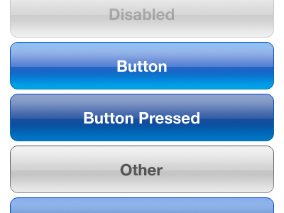
How about some variation on the one in the upper right here?
Let's not go for shiny kitsch, let's go for expensive sports car with a matte paint job.
Other than that, cross app communications (intents) and resolution independent layouts as an option would be nice and get Apple out of this weird resolution multiplier lock it seems to be trying to bust out of (with the exception of the iPhone 5).
How about other interface bits? There's a button and the screen, how about capacitive edges that can be used for interface sliders or other things? I love capacitive buttons on Android phones (when they had them).
Or let's get crazy, a completely disappearing product all together. Jam the guts into a watch, and a small wireless earpiece, or maybe ear/eyepiece and voice controls and a capacitive touch panel on the watch, don't make it look gaudy like Google Glass, get top eyewear designers to pump out different headpieces (lots of upsale potential there) etc. etc. and top watch designers to design the handpiece and turn computing into ubiquitous wearable fashion driven computing (with sales cycles as fast as the fashion industry -- seasons) and people will buy 4 sets of devices a year instead of one every two years.
"At a glance can the average user tell the difference between iOS 2 or 3 and 6?"
(A) Probably can't tell because iOS 6 is on all the phones, zing!
(B) If he's trying to cut and paste he can tell. iOS 2 won't let him do it, iOS 3+ will force him to copy the entire body text randomly, iOS 5+ will randomly offer a handful of options that generally do not include the one the user is looking for.
(C) Ok, so it's visually stagnant. I guess I'll agree here. Turns out, there's usually less to disagreements than first glance might indicate.
"any fundamental work on improving the user interaction and look & feel of the thing in 5 years."
There are certainly new gestures and there's voice. There's new functionality in the buttons and from the lock screen. I would not say this is totally accurate.
"I find it unbelievable that there's nothing that could be done better and that iOS was launched with perfect interaction design, fully formed from the heads of the designers, or perfect visual design, reverently propagated to the modern day and on into the future."
I don't see anyone claiming it's perfect but there's a good argument to be made that Good Enough + Consistent > Better. Which is to say that Apple users, who do get updated to the latest patch, might be jarred if Apple constantly yanked the UI here and there for the sake of slight benefits or "keeping the look fresh".
I think it's a tremendous strength that the design hasn't needed to drastically change in 5 years and stay competitive. A lot of people are still getting their first iDevice. If you google "android home screen"
you'll get a cacaphony of different interfaces. Android may be "converging" on the right design, a potentially better design, but meanwhile people are suffering through all sorts of inconsistencies. For the vast majority of people who want their phones to "just work", Apple's approach is better [design it right, up front, in a way that can be used for years].
That's the advantage to great design, it doesn't need to change. Every year Android/Windows comes out with a new design that's finally supposed to make it not suck. Go find a 1984 Mac, look into the top right hand corner, whats there?
Agreed, I don't see the need for change, the incremental updates have gotten us to the point where iOS functions very well. If you're looking for innovative UI there are over 600,000 apps, many of them with amazing and novel UIs very well suited to the app's function.
I acknowledge that that's not necessarily an entirely worthy goal in and of itself, but keeping a design focused product fresh does have its merits.
Here's iOS 1 and 5 side by side
http://pocketnow.com/wp-content/uploads/2012/06/ios1ios5.png
Other than the obvious lack of a wallpaper I'm not really sure that there's been any fundamental work on improving the user interaction and look & feel of the thing in 5 years.
I find it unbelievable that there's nothing that could be done better and that iOS was launched with perfect interaction design, fully formed from the heads of the designers, or perfect visual design, reverently propagated to the modern day and on into the future.
Is this really the penultimate in volume slider design? There's no more work to be done here?
http://www.uiparade.com/wp-content/uploads/2011/12/clean-ios...
I think this recent shakeup is Apple signaling that it's time to evolve again and that excites me much more than the last 2 or 3 product launches have.
If anybody can put out a new way of pushing electrons around and making it "just work" it's going to be Apple and I want to see what they come up with.